
Suzie’s Organics started as a small family project in the Pacific Northwest and grew into a regional staple. The agency I was with created their original branding, and years later, Suzie’s came back for a subtle but meaningful refresh. We kept their down-to-earth charm while elevating the brand with custom illustrations, refined typography, and a more cohesive visual system.
I had so much fun with this project, I turned it into a full-on ad campaign.
The idea: Suzie’s Organics line of condiments were never meant to be the star of your favorite dishes,
they were just meant to complement them.
The concept: Compliments anything. Complements everything.
The vibe: Wholesome dad jokes with bold, colorful design and crave-worthy visuals.

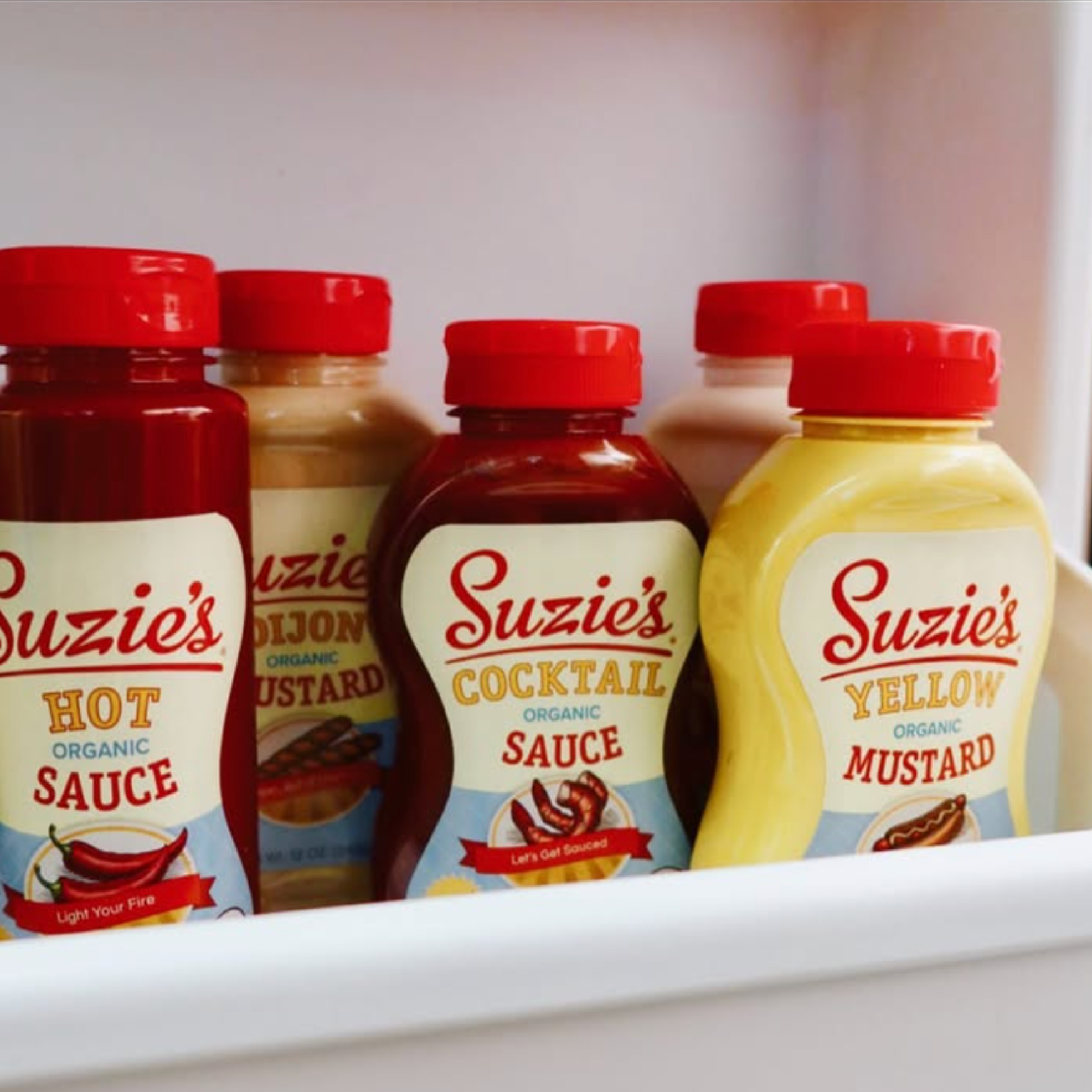
What started as just ketchup….

….developed into a robust line of 12 wholesome condiments


Plus merch!

A bold refresh that captured attention and built momentum (Image credits @suzies_organics)


The result? A sweet chorus of “Honey, I need more!”

So I designed event spaces and built vibes

And I got to work with world renowned illustrator (and genuinely great guy) Steven Noble on custom woodcut illustrations.

Fun fact: Steven’s the guy behind the Sam Adams portrait, the Coors waterfall, the Shiner Bock ram—
and oh yeah, the White House Association logo. 😮💨

This project sparked my love for illustration—something you’ll see throughout my portfolio. I’m drawn to the process: concepting, directing, collaborating, and refining to create something original alongside incredibly talented creatives.

Plus dad jokes


