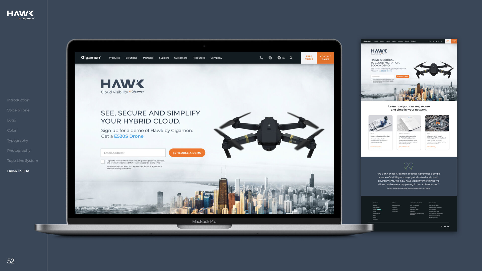
hawk takes flight
To support Gigamon's expansion into the cloud, we created Hawk—a new cloud-focused sub-brand designed to signal speed, visibility, and innovation while remaining unmistakably Gigamon.
As Art Director, I helped shape the brand from the ground up, leading the identity, campaign development, and launch across video, OOH, digital, and CRM.
The work drove a 35% increase in cloud pipeline, expanded enterprise engagement, and scaled across 15+ global teams.
campaign launch video
Internal company teaser video
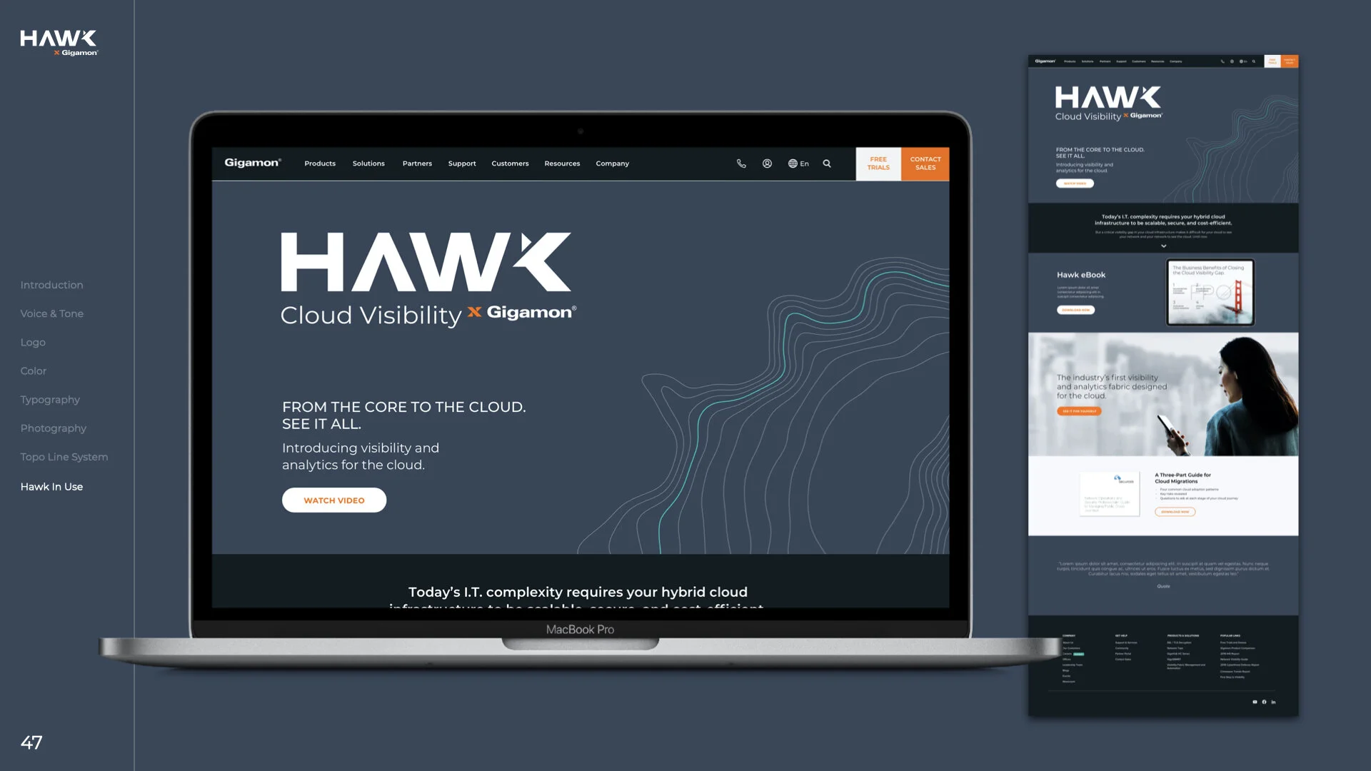
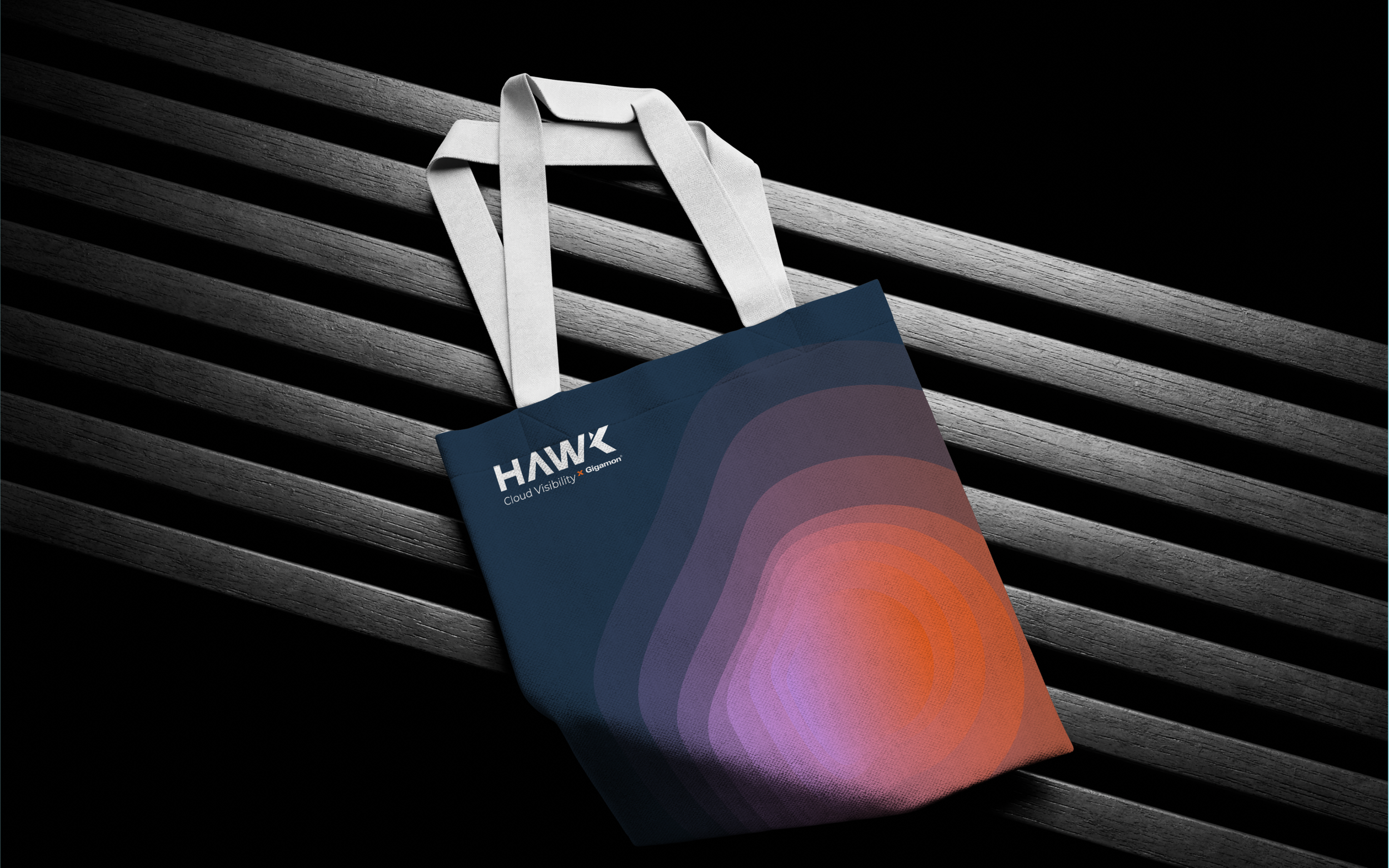
Hawk Design System

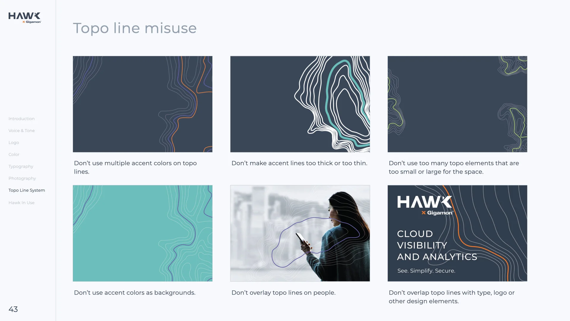
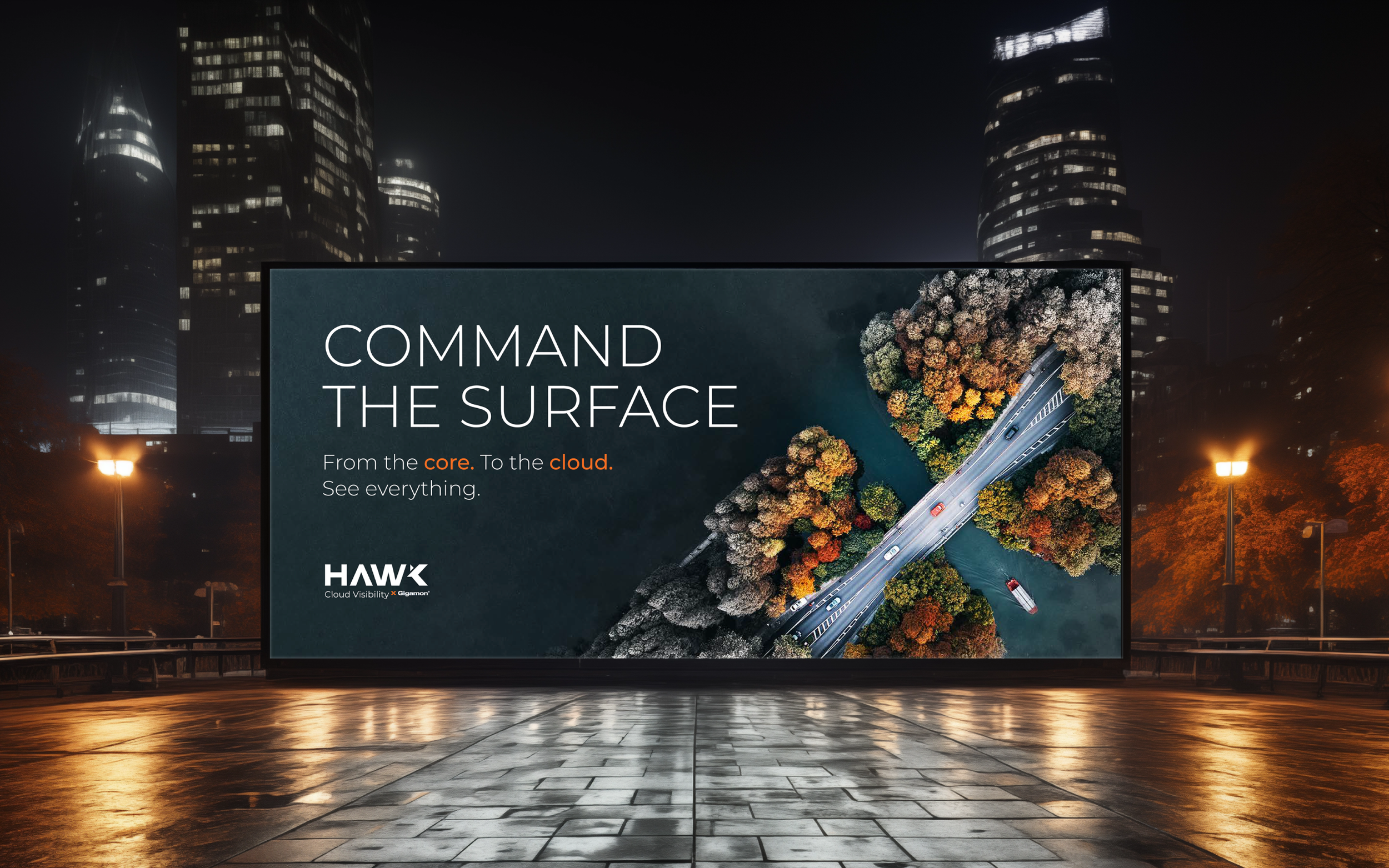
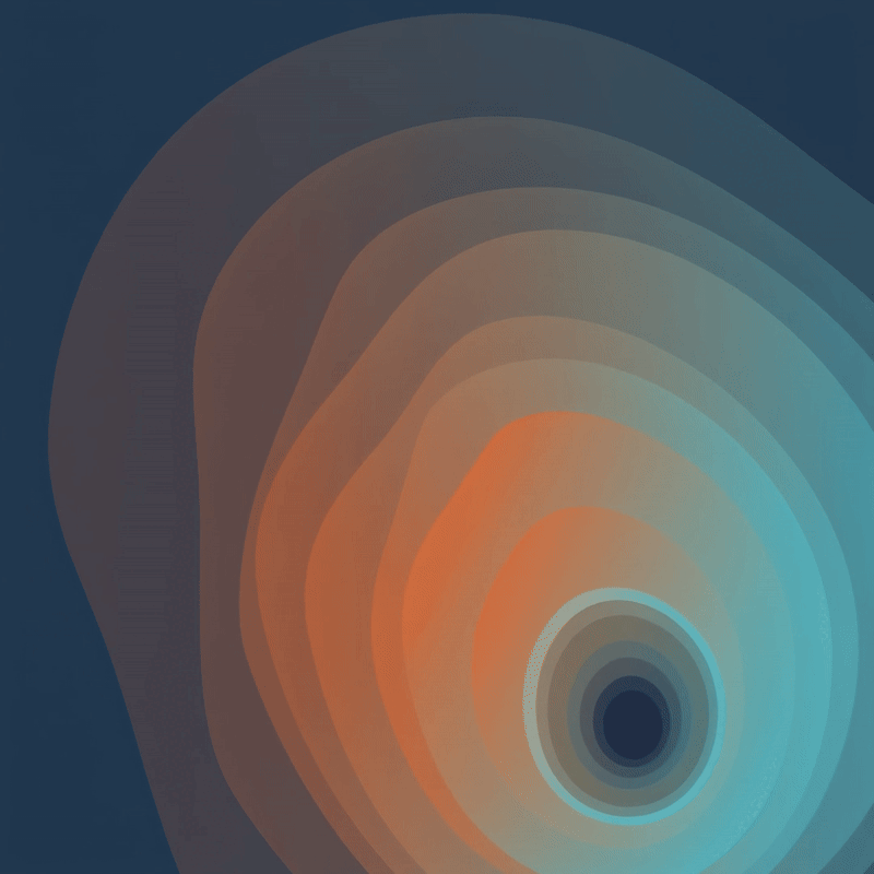
Topographic Lines & Elevation Maps
Inspired by elevation maps and a hawk’s view in flight, topo lines are a defining element of the Hawk design system, representing its ability to scan and understand complexity from above.


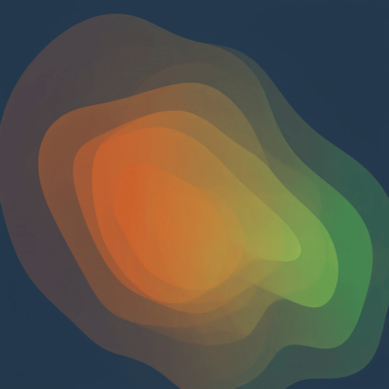
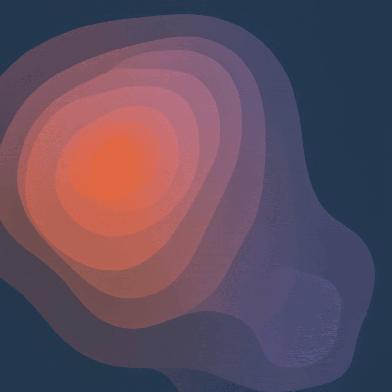
Gradient & Line Styles
The system uses two topo line styles: bold gradient lines for key moments and refined line-art
overlays for flexibility. Both create strong contrast on Meteor Blue and scale across applications.

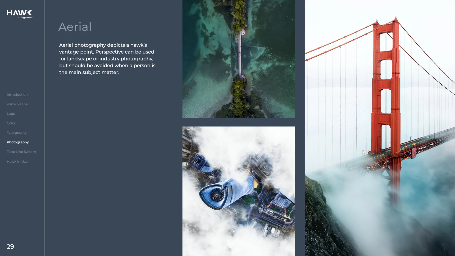
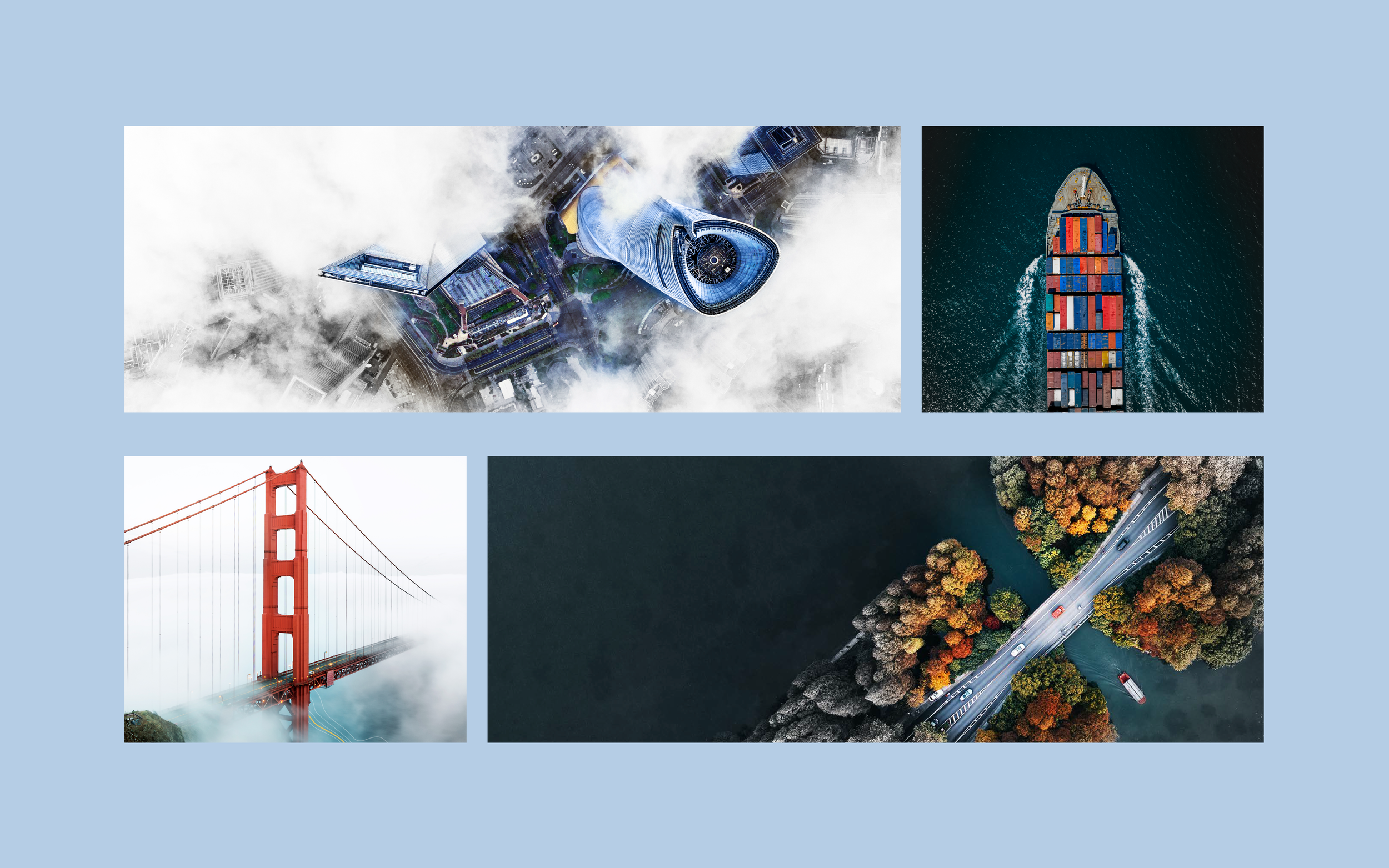
Spotlight Photography Treatment
Used to highlight the focal point in full color while desaturating the rest—creating a clear visual
hierarchy and drawing the eye with intent. Reinforcing Hawk’s focus on precision and visibility.


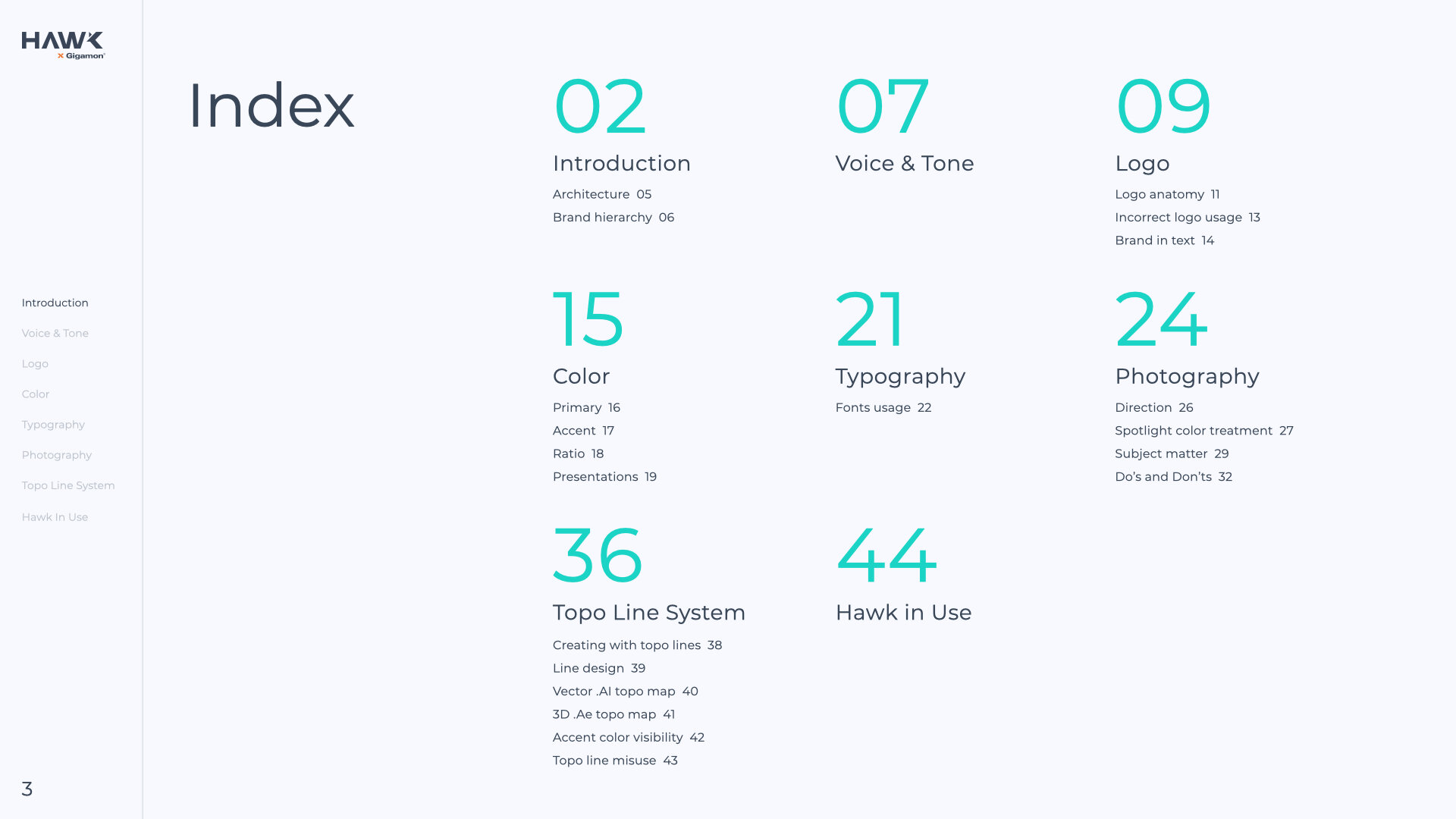
Complete brand guidelines