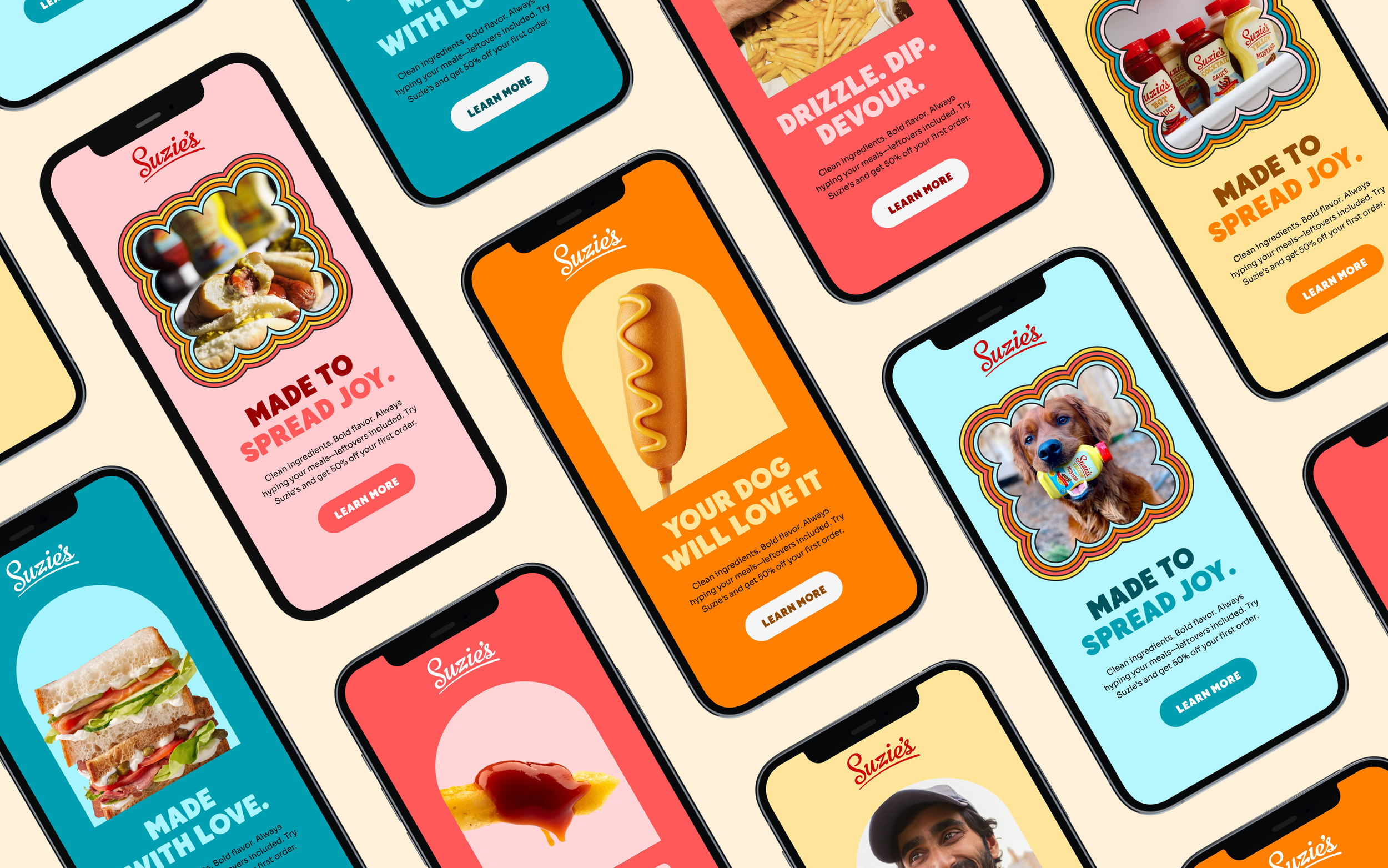
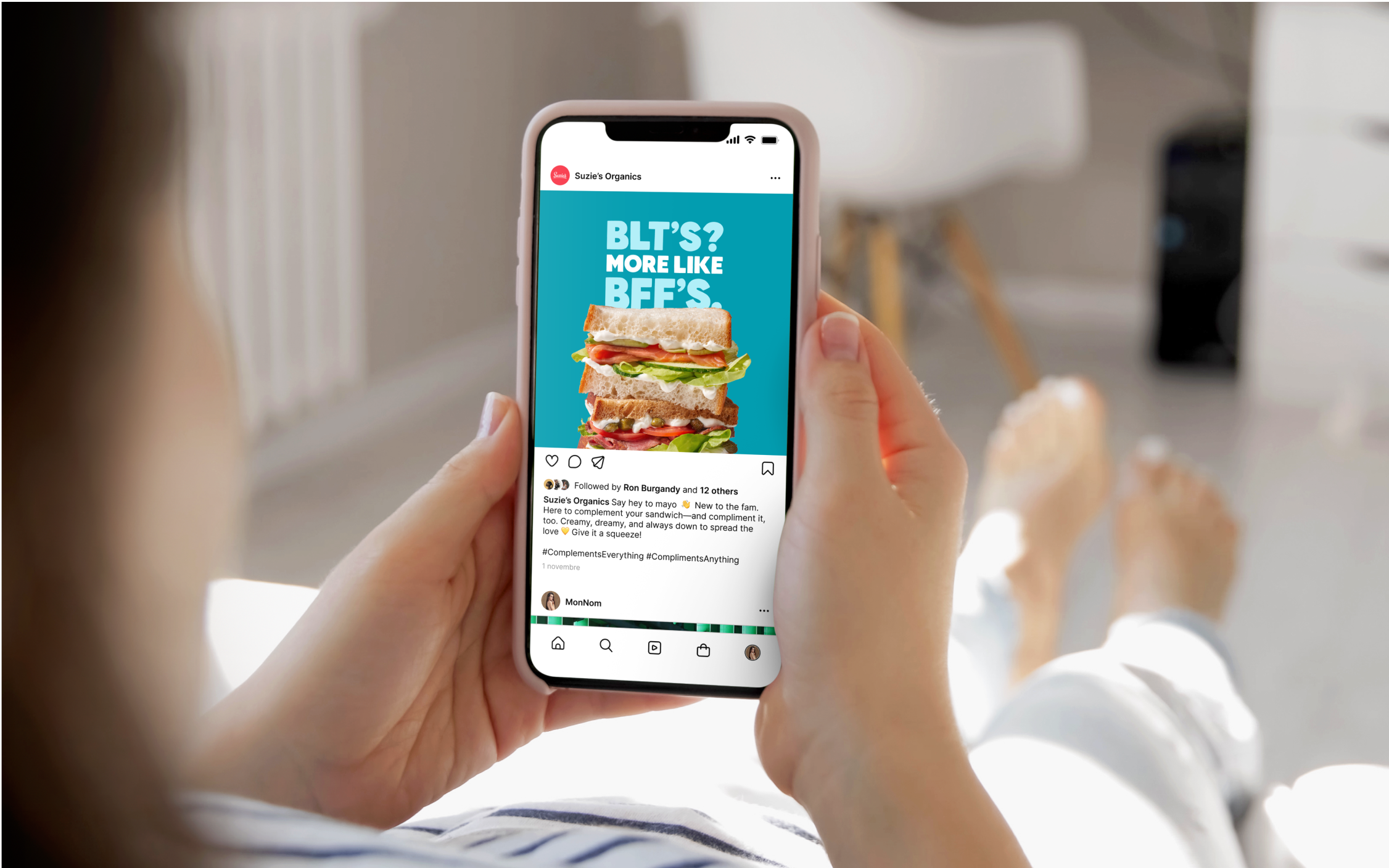
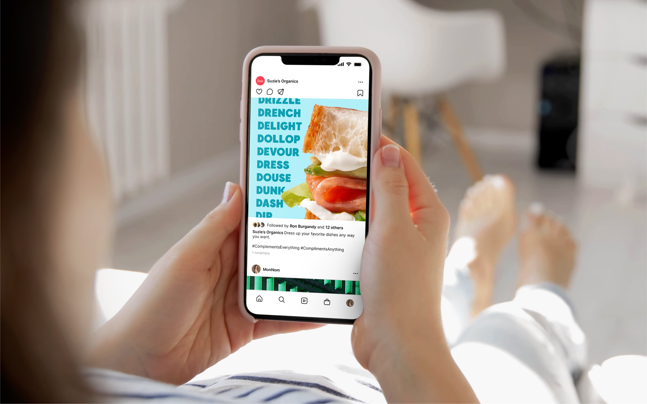
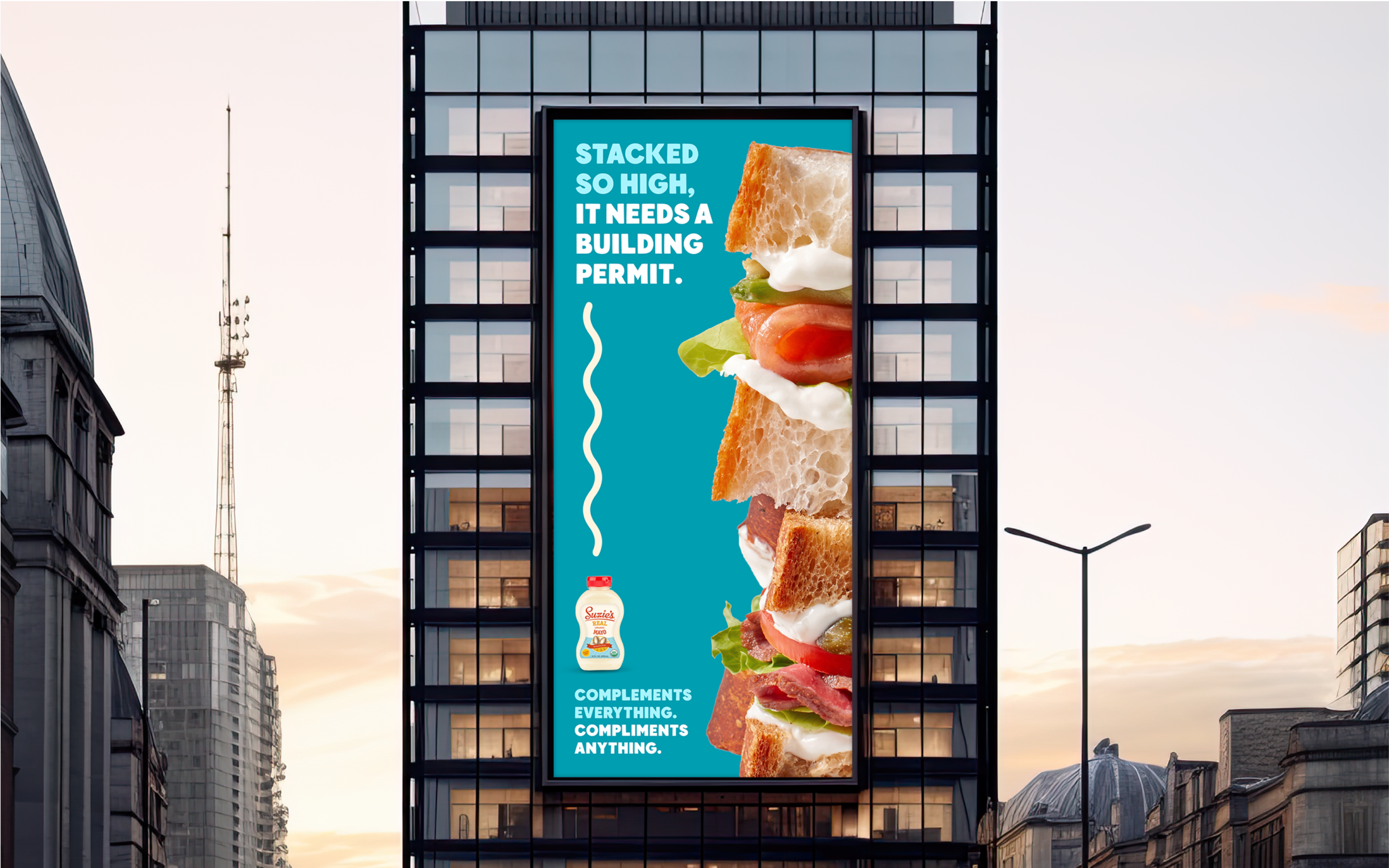
In addition to extending Suzie’s condiment line, we created a cheeky ad campaign to bring the refreshed identity to life. The goal was simple: show that Suzie’s isn’t just a condiment—it’s your dish’s biggest hype-person.
The challenge
Translate Suzie’s playful, redesigned brand into a campaign that could cut through clutter, charm audiences, and make condiments feel like characters worth rooting for.
The idea
We launched a bold, tongue-in-cheek campaign that positioned Suzie’s as the ultimate sidekick—cheering on grilled cheeses, boosting fries’ self-esteem, and spreading the love to every plate it touched. The work leaned into humor, personality, and a wink of self-awareness, all while staying true to the clean but quirky design system.
My role
As Creative Director, I oversaw and executed the design and concepting of the campaign—guiding the team in pairing our updated visual system with a playful brand voice.
The impact
Although never launched publicly, the campaign resonated so strongly with the client that it secured $500K+ in new business for Suzie’s hard seltzer line. It proved the identity’s flexibility, strengthened client trust, and expanded our partnership into new categories.


A complimentary campaign
Complements everything. Compliments anything.
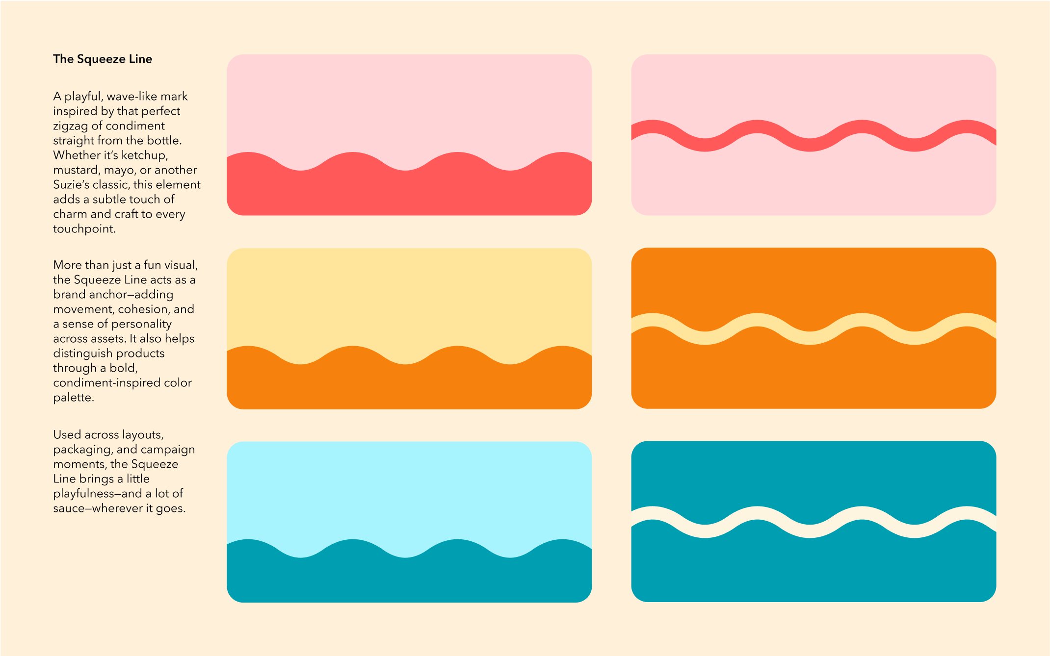
To launch Suzie’s expanded condiment line, we created a campaign full of joy, humor, and personality—engaging loyal fans while inviting new ones, all without losing Suzie’s charm.
It started with a word: condiment. Defined as something that enhances or complements food. That double meaning—complement vs. compliment—sparked the idea: what if a condiment could do both? From there, Suzie’s became the ultimate foodie hype friend.
A design system built to scale, evolve, and delight.
Bold type, playful squiggles, an inverted color palette, vibrant lifestyle photography, and craveable AI-generated dishes all work together to complement Suzie’s charm. The result? A flexible, flavorful system full of personality, color, and dad jokes.
Artificial intelligence. Real cravings.
Midjourney helped me cook up hyper-realistic food imagery that made Suzie’s condiments shine. It was a fun, forward-thinking way to explore visual concepts, bring more personality to the brand, and show how AI can turn up the taste and creativity in unexpected ways.
Real food. Real people. Real flavor.
I used lifestyle photography to capture Suzie’s in her element—being drizzled, dipped, and devoured in real kitchens with real people (and dogs). Every shot is rooted in authenticity, bringing love, flavor, and a little mess.
Type you can taste.
The typography was carefully chosen to do more than inform—it engages. Bold and expressive, it adds personality, punctuates key messages, and reinforces the brand’s playful tone.
Designed to Stand Out
Macro photography combined with BIG out of home executions spotlight Suzie’s in craveable detail—showing that while condiments aren’t the star, they’re essential.
A complementary Design System
Suzie’s is a best friend in brand form—warm, playful, confident, and always bringing out the best in every dish. The design reflects that spirit: colorful yet intentional, supportive yet bold.
Built to flex and scale, the system seamlessly grows with Suzie’s—whether it’s a new condiment, a new season, or a new reason to hype up your food.