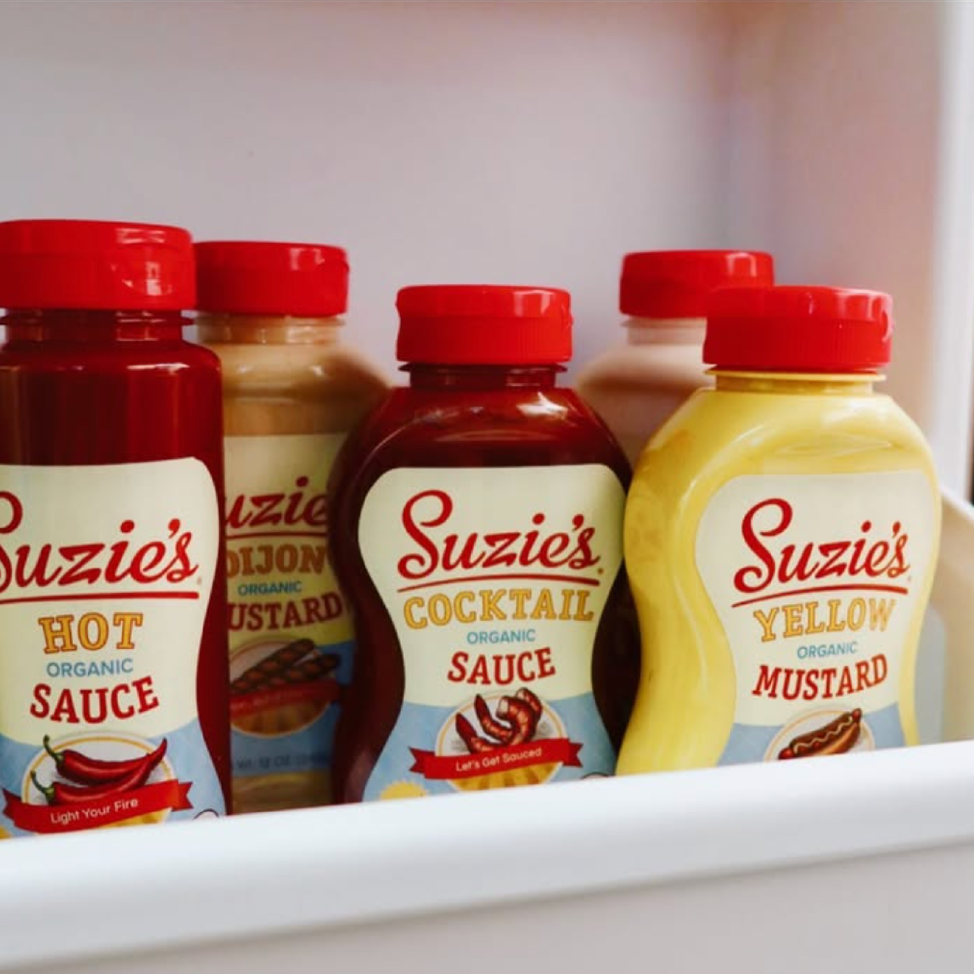
Suzie’s Organics was growing fast—expanding from a few condiments to a full shelf presence—and needed a bold, cohesive identity to match. We set out to evolve the brand without losing its charm, expanding Suzie’s from 3 condiments to a robust line of 12.
The challenge
Scale Suzie’s from three products to a full lineup—building a cohesive identity that could stand out in crowded aisles while keeping the brand’s playful charm intact.
The idea
We built a refreshed design system and illustration style that balanced clean shelf presence with quirky personality.
My role
As Creative Director, I led Suzie’s brand evolution—overseeing design, art direction, and campaign development. I modernized the visual system with illustrator Steven Noble and guided the team in shaping a distinct, ownable brand voice.
The impact
The work helped secure placement in 1,000+ new retail locations, and boost year-over-year sales by 35%. It also opened the door to future creative, including a full brand extension into hard seltzer.


Product Expansion
What started with just ketchup…
….developed into a robust line of 12 wholesome condiments
Plus merch!
A bold refresh that captured attention and built momentum (Image credits @suzies_organics)
The result? A sweet chorus of “Honey, I need more!”
So I designed event spaces and built vibes
And I got to work with world renowned illustrator Steven Noble on custom woodcut illustrations.
Fun fact: Steven’s the guy behind the Sam Adams portrait, the Coors waterfall, the Shiner Bock ram—and oh yeah, the White House Association logo. 😮💨
This project sparked my love for illustration—something you’ll see throughout my portfolio. I’m drawn to the process: concepting, directing, collaborating, and refining to create something original alongside incredibly talented creatives.